Every month we pull together tools, research, and ideas for journalists wearing… many hats.
This column started as a newsletter on iMEdD’s LinkedIn.
You can subscribe and find all past issues here.
Media Hat: Working around missing pieces
iMEdD’s monthly column with tools, resources, and ideas that meet the needs of journalists.
Trying something a bit different this time: focusing (mostly) on one thing. This edition is about working with data. How to visualize it, turn it into a chart, or just make it easier to read and use in your reporting.
We’ve also pulled together a few tools, some examples, and a couple of initiatives worth keeping an eye on (especially if you’re a European journalist, scroll all the way down!).
And if you’re one of the many people who are new here, welcome.
Each month, we round up tools, ideas, and behind-the-scenes insights to help journalists who wear many “hats”: reporters, editors, producers, creators, and everything in between.
Up your sleeve
Tools and tricks you can put to work right away
Making charts without starting from scratch
From what we read, in NICAR they played around quite a bit with this one. Chartle turns simple text prompts into ready-made charts: just describe what you want, and it pulls data, picks a format, and builds it fast. It also recreates charts from screenshots, which makes it useful for extracting visuals from reports and PDFs without starting from scratch.
👉Take a look
📌 Good for: data journalists, newsroom designers, investigative reporters
Speaking of charts, have you played with this one?
https://flowingdata.com/2025/09/18/chartle-a-daily-guessing-game-with-charts/
Exploring data directly on a map
This one is worth a look. Benjamin Niedermann shows how VisQuill Lens lets you explore geographic data by placing movable “lenses” over a map—assign categories, adjust radius, and see patterns update in real time. It runs in the browser and you can simply upload a CSV to get started. You can also export it as a standalone page to embed or share.
👉 Try it
📌 Good for: data journalists, mapping specialists, newsroom developers, investigative reporters
Using AI to extend investigative work
Buried Signals, which is launching in May 2026, will use monitoring agents and research pipelines to scan public records, verify information, and surface patterns and then turns findings into short-form visual stories. The focus isn’t just on the tools, but on sharing workflows and methods so others can apply them in their own reporting. They’ve also released skills, a Claude Code plugin marketplace for journalists and investigators.
👉 Scroll around
📌 Good for: product managers, investigative journalists, designers
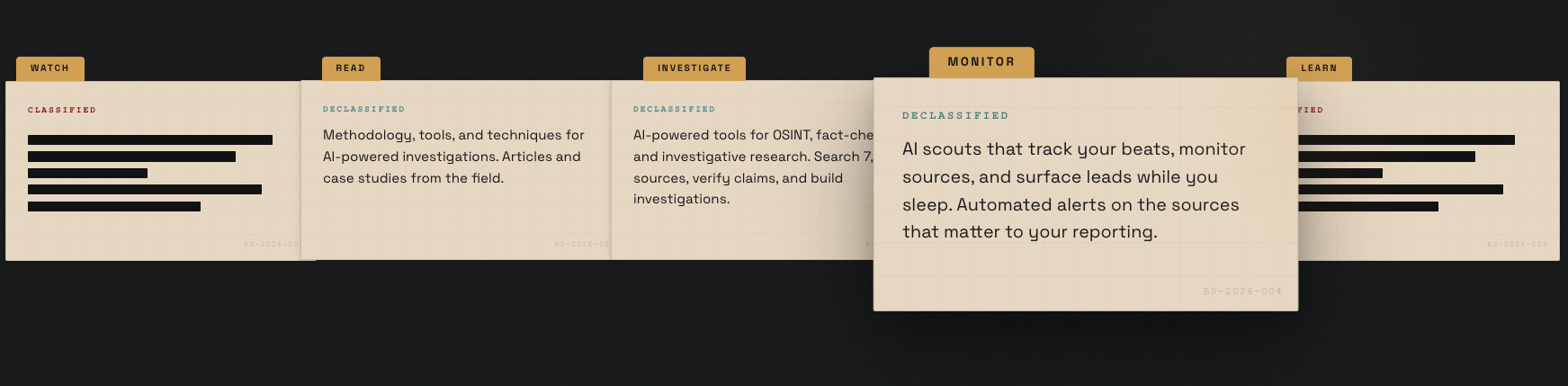
Behind the scenes
Research, explainers & deeper context to help you connect the dots
Making scale visible in storytelling
This one caught our attention, both for the subject and how it’s presented. Marco Hernandez (Graphics Editor at the New York Times), shared a behind-the-scenes look at building a Moon model—3D-printed and hand-painted to match how astronauts actually see it from Orion (think: basketball at arm’s length, according to NASA).
👉 Watch
How gamification supports a story
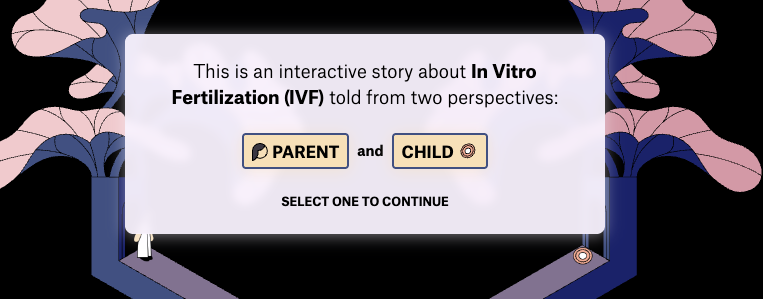
The Pudding published the code for A Journey Through Infertility by Lam Thuy Vo, an interactive story about In Vitro Fertilization (IVF) told from two perspectives. Built with SvelteKit and D3, it uses an illustrated, game-like world that moves as you scroll, alongside simple data visuals like costs across U.S. cities. A clear example of combining data storytelling in one piece.
Community Spotlight
New voices, bold experiments, and big ideas from the field
A retreat focused on reporting under pressure
The open call is open until May 11 (quick one!) This is a call for a four-day European Journalist Retreat by the Global Center for Journalism and Trauma in partnership with iMEdD. It focuses on trauma-informed reporting, resilience, and handling complex stories. The retreat takes place 14–18 October in Vamvakou.
👉 Apply by May 11 if you want in.

Rethinking your tech setup
This one is more about reflection than the tool itself. Sérgio Spagnuolo, John S. Knight Journalism Fellow at Stanford, through the Journalism Relay Project, is developing an assessment to help you understand how dependent your workflow is on Big Tech. The Dependency Index scores your setup from 0–100 based on how concentrated your tools are among major companies—highlighting structural reliance rather than making value judgments. 👉 It’s just published, so feel free to share your thoughts
Fresh from Perugia
We’ve just got back from the International Journalism Festival #ijf26 and still have a lot to take in. In the meantime, you can watch many of the sessions on demand. Worth a scroll to see what people are talking about.
👉 Watch here & Read a few highlights from our team.
Let’s Chat!
If something here sparks a thought, we’d love to hear it. And if you want to pass this along to someone who might enjoy it, thank you! That’s how this little community grows.
See you next month!