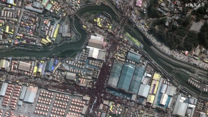
A guide for journalists on how to observe and measure the reduction of water reserves in water bodies with the use and the analysis of satellite images. We looked into the Aposelemi Dam in the island of Crete and found it to be 63% smaller than it was in 2020.
In July 2024, the Greek public broadcaster, ERT, reported on the reduction of the water level in the Aposelemi Dam in the island of Crete, as found by the National Observatory of Athens. About a year later, iMEdD calculated that the surface area of the reservoir has decreased by 13.2% compared to 2024.
The dam is the largest water supply project in Crete, with a total capacity of more than 27 million cubic meters and a surface area of almost 1.93 square kilometers. It is located near the settlement of Potamies in the Heraklion regional unit. According to the Organization for the Development of Crete S.A. (OAK S.A.), since 2012, it has supplied water to the cities of Heraklion and Agios Nikolaos, six municipalities, and 19 settlements.
Water Reserves in Attica from 1985 to the Present Day
We have collected historical data on the water reserves in Attica’s reservoirs and are publishing it as an open dataset.
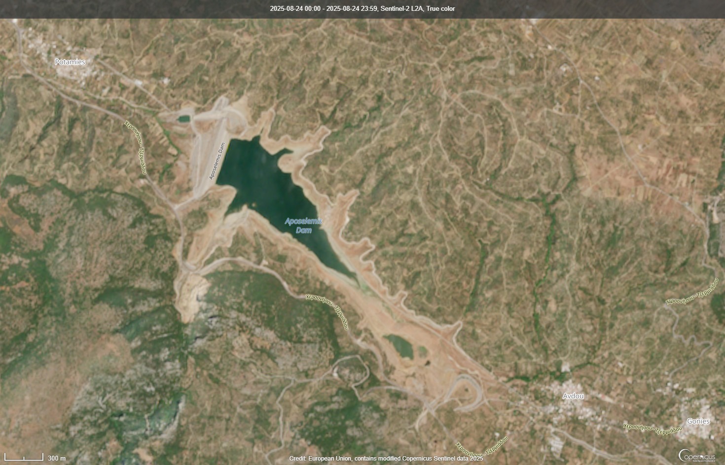
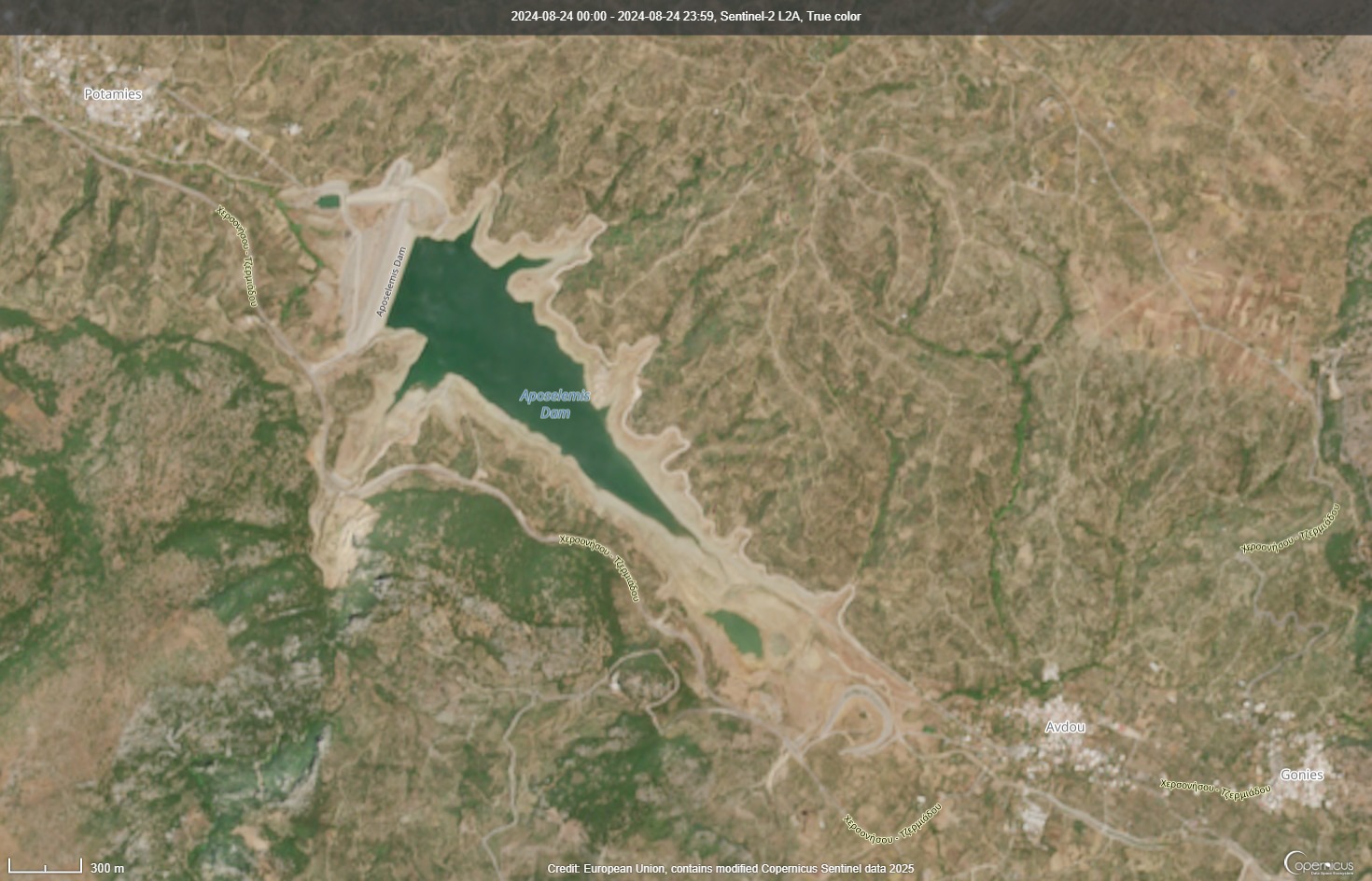
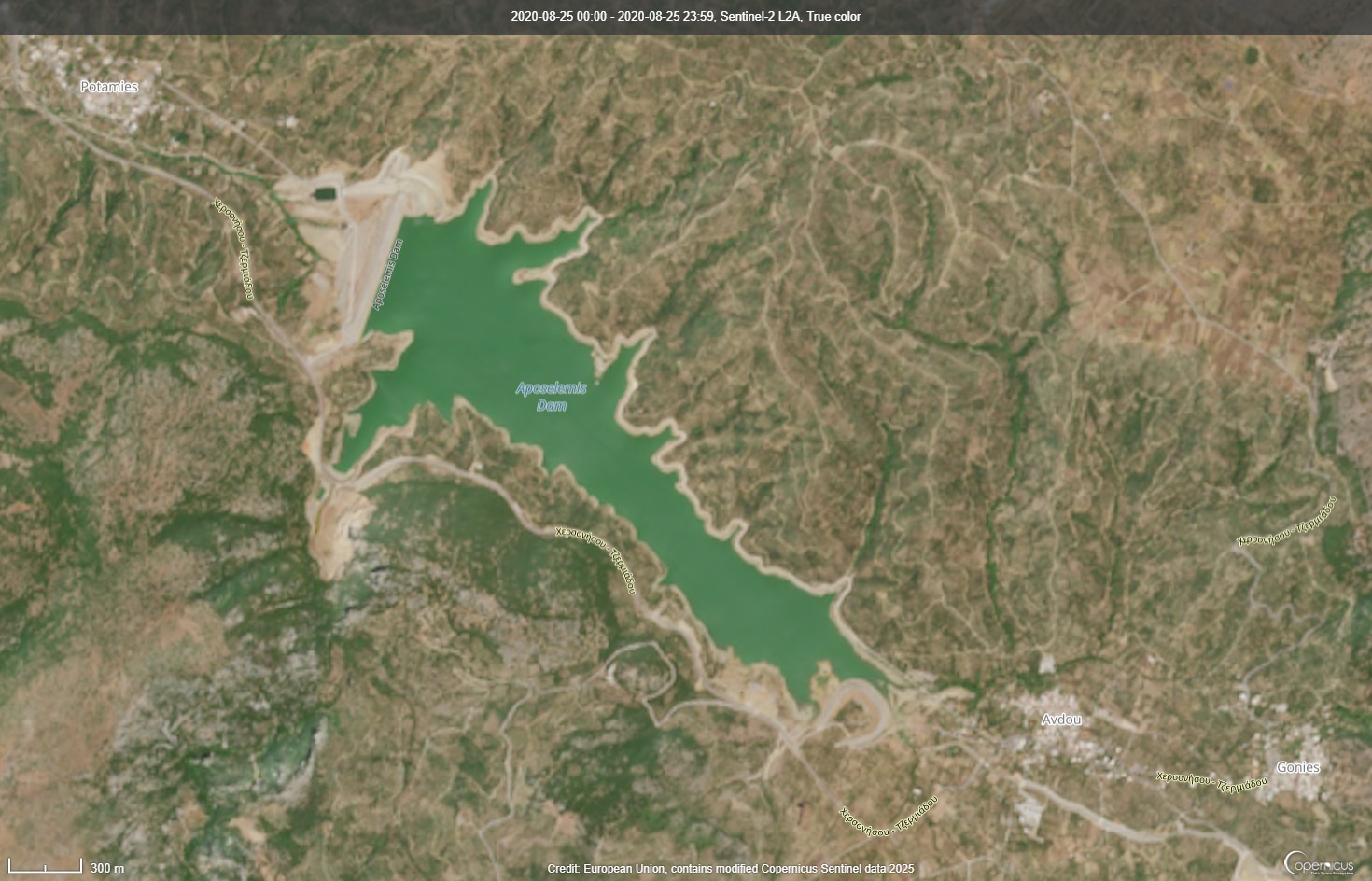
As an example, we examined satellite images of the lake for the month of August each year over the past decade. The size of the lake appeared to fluctuate frequently, with the lowest water levels observed in August 2018, a drought year for the island. We studied in more detail the lake’s surface area in August of 2020, 2024, and 2025. While in August 2020 the reservoir covered about 1.12 square kilometres (57.4% of its total surface), by 2025 only 21% of the lake contained water.
To confirm the change in the amount of water in the artificial lake, we calculated the size of the water surface at three different points in time over a five-year period. The analysis was carried out using satellite images provided through the Copernicus Browser service, part of the European Commission’s Copernicus program.
This method of analysis can also be applied to larger bodies of water, flooded areas, or for measuring drought. Below, we present how we measured the area covered by water, using the artificial lake of the Aposelemi Dam as an example.
The satellite images of Sentinel-1
Step by step how we download a satellite image
- To access the data on the Copernicus Browser platform, we first need to log in, which is a quick and easy process.
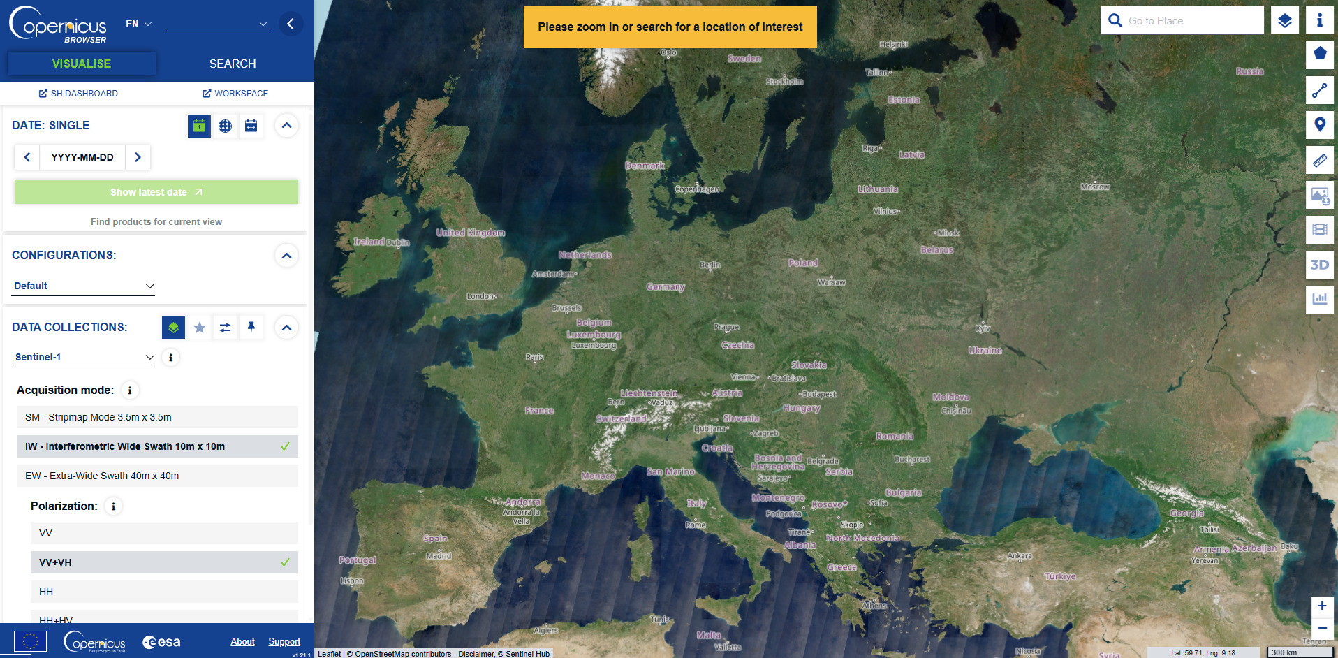
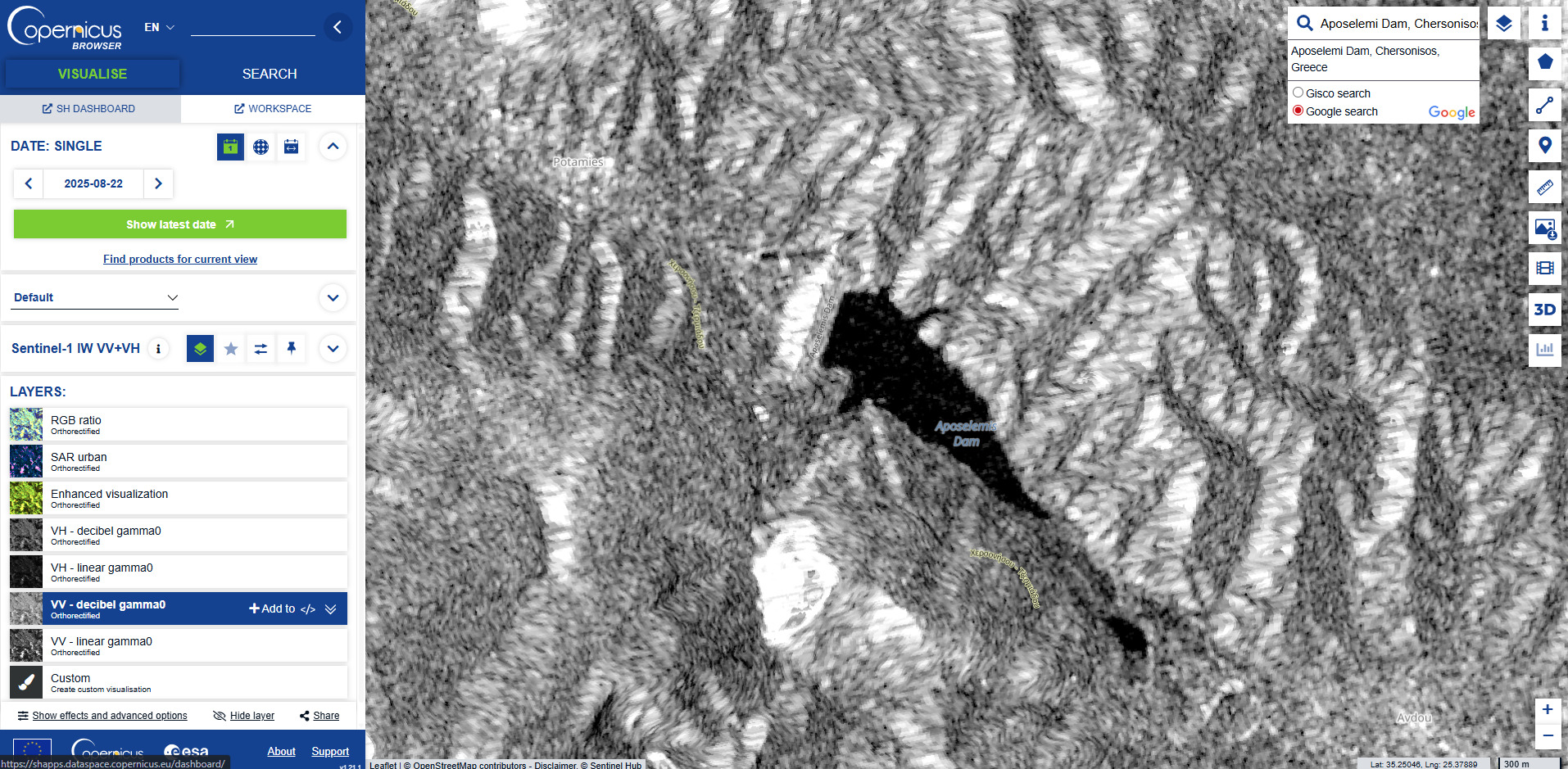
- We type the name of the area we want to investigate (hereby “Aposelemi Dam”) in the search bar on the top right side of the webpage (“Go to Place”). Then we select the search results from the Google Search option.
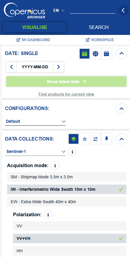
- From the left-hand menu, we select the satellite whose images we will use and the method of measuring the Earth’s “reflectivity” when the radar sends a signal to it. In the “Data Collections” menu, we select the Sentinel-1 satellite, and in the “Layers” menu we choose the VV – decibel gamma0 image type, which is considered ideal for water-related measurements, since the difference between water and land is the most distinct.
- Next, we open the calendar that displays the available dates of satellite captures and select the date we want to analyze. To compare satellite images of different dates, we repeat the same process for each of them. For this study, we used August 23, 2020, August 21, 2024, and August 23, 2025, the closest available dates to each other for those years.
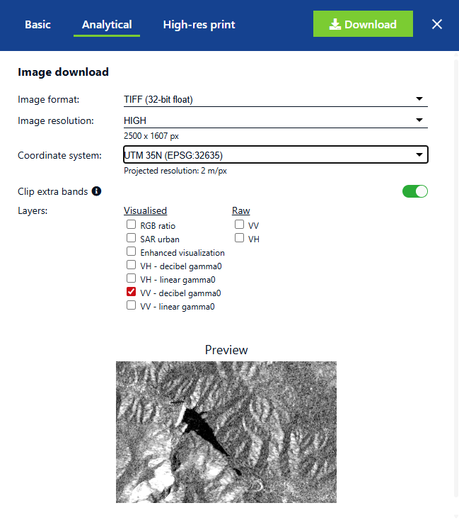
- From the right-hand menu, we then select Download image (the fourth button from the bottom) and download the image from the Analytical category in TIFF format (32-bit float), which preserves geospatial coordinates. We set the image resolution to MEDIUM or HIGH for greater accuracy and select the appropriate Coordinate Reference System (CRS) for the country we are studying. For the Aposelemi Dam reservoir, we used the UTM Zone 35N (EPSG:32635), which applies to areas of eastern Greece.
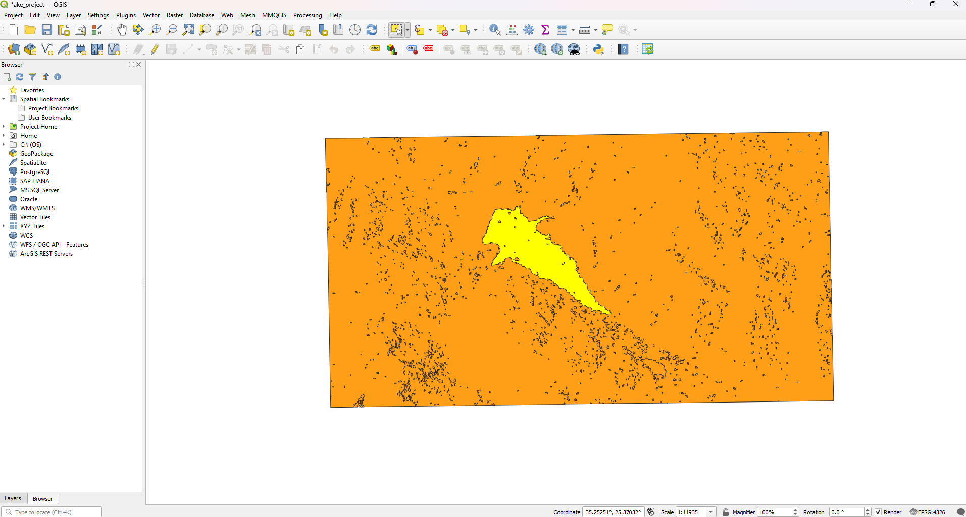
Mapping with QGIS: Part 1/4

In the first part of the tutorial, we demonstrate how to find and load data into QGIS.
From raster to vector
The process before we analyze the satellite images, step-by-step
Next, we proceed to analyze the downloaded images. It’s important to note that the analysis data is not absolute; it provides a realistic representation of the change in the borders of the surface water. To achieve this, the images must first undergo a specific type of processing.
Satellite images follow a data model called Raster (pixel-based). In this model, the data appears as an image resembling a mosaic, where each pixel has a value. To be able to analyze the image data, we converted the Raster into a Vector model. The vector model contains descriptive features consisting of points, lines, and polygons—essentially the outlines of the elements depicted, such as the outline of a lake. For this conversion and analysis, we used the open-source geographic information system software QGIS (Quantum Geographic Information System), which can be freely downloaded from its official website. QGIS works by organizing geographic data into layers, each representing different types of information, stacked on top of each other to create a complete map.
- We then open QGIS and upload the image by selecting “Layers” from the top menu. Under “Add Raster Layer”, we import the TIFF files previously downloaded from the Copernicus Browser.
- The lake appears as the darkest part of the image, and it is surrounded by pixels in different shades of grey. This happens because each pixel has a different value, which represents how much of the energy sent by the satellite radar is reflected to it. The less energy that returns, the smoother the surface; therefore, the lower the pixel value, the darker it appears. Water reflects the radar signal away, so almost no energy returns to the satellite, meaning that water pixels have values very close to zero and thus appear black.
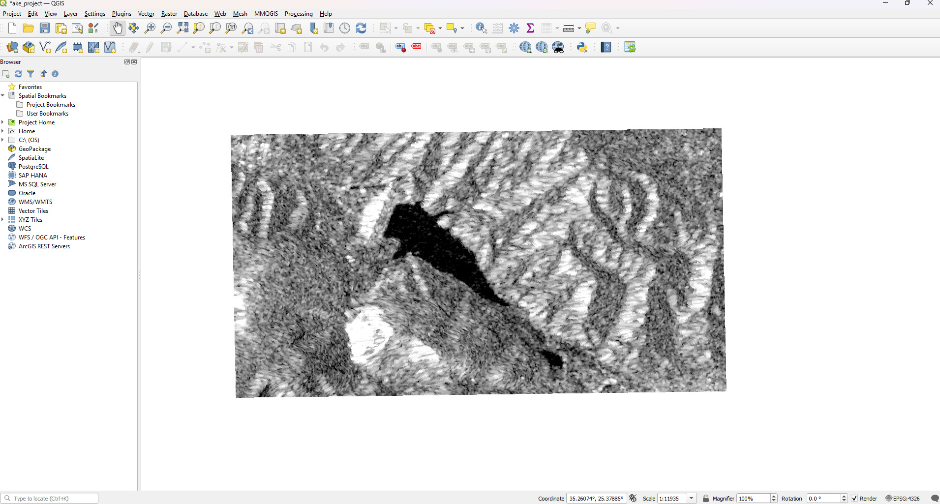
However, the shades of grey that represent land can be misleading for QGIS, and when the image is converted into a Vector, the boundaries of the lake may be distorted. For this reason, before the conversion, it is useful to create an image made up exclusively of black and white pixels. This simplifies the data, since each pixel is given an absolute value (0 or 1), making the lake’s boundaries clearer and more reliable.
In this new version of the image, the water —which in the original image had the lowest values (close to 0, shown as black)— will now be classified with the value 1 (white), while all other values will be classified as 0 (black).
- To do this, we follow the path: Raster > Raster Calculator. To save the file, we define a name and the location on the computer where it will be stored (see Output layer). Then, we select the coordinate reference system (CRS) of the QGIS project, which must match the one previously chosen in the Copernicus Browser. For the Aposelemi Dam, this is UTM Zone 35N (EPSG:32635). Finally, from the Raster Bands box, we copy the Band ending with “@1” and paste it into the “Raster Calculator Expressions” box, where, enclosed in quotes, we apply the following formula:
“filename@1” <= 0.2
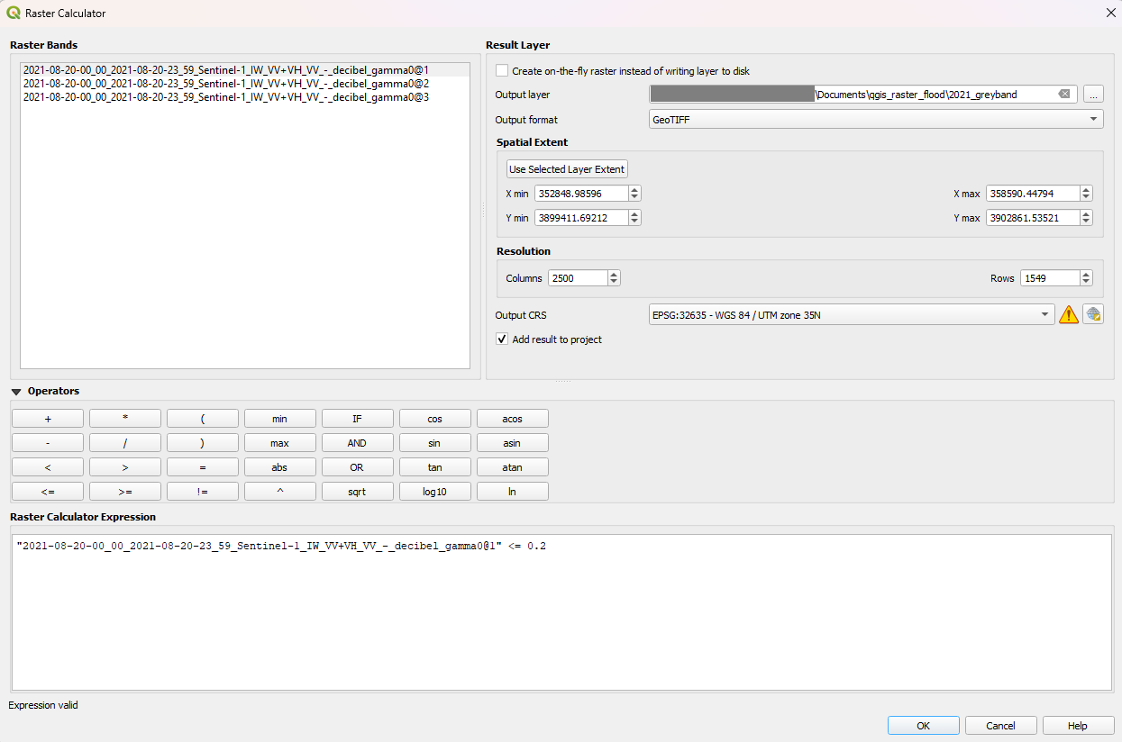
This way, every pixel with an energy value less than or equal to 0.2 will be classified as white (water) and all other values will be classified as black (land). The threshold we set is not fixed and may vary depending on the specific study. For this reason, it is recommended to run a few tests to determine the value that best represents the body of water in your own analysis. A useful way to examine the range of values in the image is through the Histogram. This can be done in QGIS by opening the Attribute Table, selecting Histogram from the left-hand menu, and clicking the “Calculate” button.
The resulting graph shows the frequency of values in the Raster model, allowing you to identify the most common ones from which to choose. Remember that, since we are interested in detecting the darkest pixels (which correspond to water), the threshold you define should be close to 0.
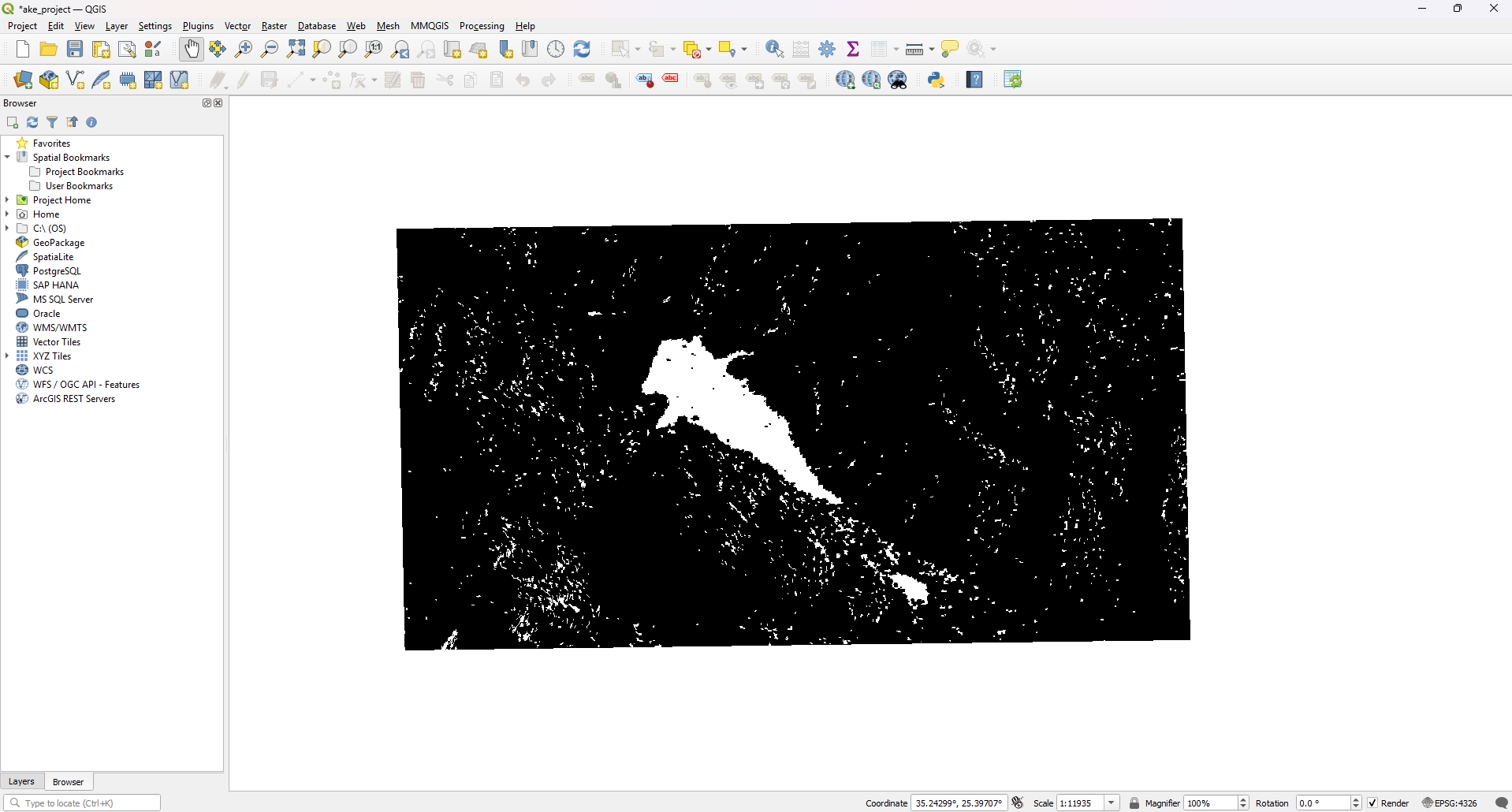
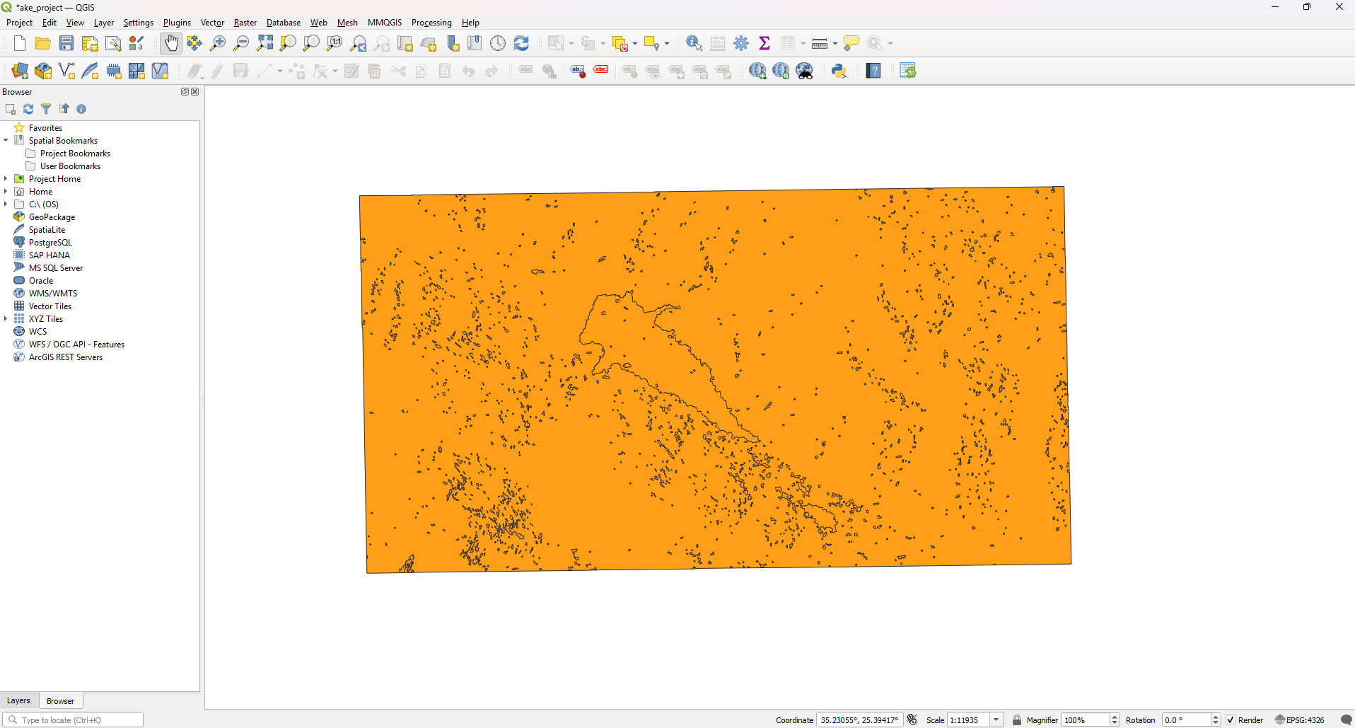
4. Once we have created the black-and-white image, we go to the top menu and follow the path: Raster > Conversion > Polygonise (Raster to Vector), to convert the Raster file into a Vector. From there, we select “Band Number: Band 1” and save the new layer on our computer.
Why Any Reporter Can Now Source Free, Quality Satellite Images of Almost Anywhere on Earth
Journalists can now get free high-resolution satellite images from around the world in minutes, without any specialized knowledge.
Calculating the difference in lake area across years
How to measure the shrinkage of the lake in QGIS, step-by-step
- To select the artificial lake, we use the “Select Features” tool from the toolbar at the top of the QGIS window and click on the main shape (polygon) that represents the lake. If the lake consists of multiple shapes, we also select those by holding down the CTRL/Command key.
- By right-clicking on the Layer we created, we select “Export” and save “Selected Features As…”, and save the lake as a new Layer, making sure to preserve the coordinate reference system. Ensure that only the shape of the lake is selected, which in QGIS appears highlighted in fluorescent yellow.
- Next, we right-click on the new Layer we just created, open the Attribute Table, and then select the “Field Calculator” tool. In the top-left of the window, we check “Create virtual field” and create a new field named area_sqkm. Under “Output Field Type”, we select “Decimal number” and enter the following expression in the Expression field:
area($geometry)/1000000
This calculation shows the size of the lake in square kilometres. Click “Create” to apply.
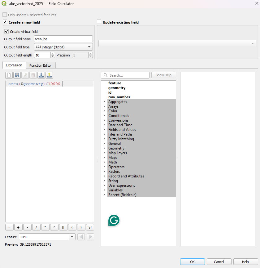
- The new area_sqkm field of the Attribute Table displays the surface area of the lake in square kilometres. If the lake consists of multiple shapes, we add the results together to obtain the total surface area.
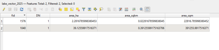
- We repeat the same process for all images and calculate the difference in lake size by subtracting the area of the earlier year from the most recent one.
Measurements and conclusions on the reduction of water reserves
Based on the measurements above, we calculated the annual change in lake surface area from 2020 to 2025. The table below shows the reduction in water surface. As can be seen, in August 2025, the surface of the lake was about 0.063 square kilometres (6.3 hectares) smaller than in 2024, meaning the water surface has decreased by 13.2% since last year.
| Year | Area (km²) | Area Difference (km²) | Annual Change (%) |
|---|---|---|---|
| 2025 | 0.414 | -0.063 | -13.2 |
| 2024 | 0.477 | -0.103 | -17.8 |
| 2023 | 0.580 | -0.497 | -46.1 |
| 2022 | 1.077 | -0.022 | -2.0 |
| 2021 | 1.099 | -0.019 | -1.7 |
| 2020 | 1.118 |
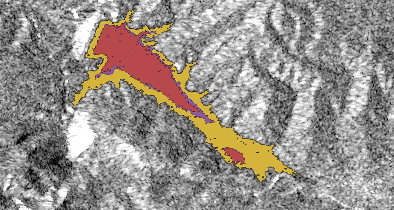
The reduction in water reserves at the Aposelemis Dam is evident in the image below, which was created in QGIS. The yellow line shows the lake’s boundaries in August 2020, the purple line shows the boundaries in August 2024, and the red line shows the surface area in August 2025.
Below are the satellite images of the Aposelemi Dam from August 2020 (left), 2024 (center), and 2025 (right), as downloaded from the Copernicus Browser.
Many of the practices applied here were inspired by, or drew on information from, the workshop “Beyond the pixels: the power of raster data in QGIS” with Kuang Keng Kuek Ser and Federico Acosta Rainis at Dataharvest 2025, as well as the workshop “Creating simple maps for publication with satellite images” by Laura Kurtzberg at NICAR2025.
She will also be present at this year’s Διεθνές Φόρουμ Δημοσιογραφίας του iMEdD. For more hands-on knowledge about working with satellite data, see the workshop “How to use free satellite imagery and data to investigate natural disasters“, which will take place on September 26 as part of the Forum.