The use of sound to render data is an approach that periodically resurfaces in journalism. We spoke with professionals experimenting with the method to understand how it is evolving, what its future may be, and what it can offer the wider journalistic community.
Translation: Anatoli Stavroulopoulou
Featured illustration: Evgenios Kalofolias
In an article published 15 years ago, titled “Fractions of a Second, an Olympic musical,” Amanda Cox, then editor of data journalism at the New York Times, showed how far athletes at the 2010 Winter Olympics were from the gold medal by translating their finishing moments into sound within a shared time frame. Fifteen years later, Larry Buchanan, now a reporter and graphics editor at The New York Times, said the piece inspired him to pursue a career in graphics. “It’s actually the piece that inspired me to be a graphics editor, to work in graphics,” he told iMEdD. “I didn’t understand what it was. I didn’t understand why it was. I didn’t understand how it came to be, who made it, why it counted in the bucket of journalism, and why it affected me so viscerally.”
Eliot Higgins: Algorithms, spies and Trump in the mix
The founder of the investigative platform Bellingcat speaks about algorithms and democracy in the 21st century, the world of intelligence services, and how investigative journalism is funded in the era of Trump.
Cox’s piece is considered one of the earliest examples of data sonification in journalism. In recent years, the method has appeared more often at journalism conferences, and in 2025 the Data Sonification Awards were announced for the first time, with a special Communication category for journalistic, communication, and educational projects. Still, data sonification has not yet reached the scale or impact of data visualization, and the aesthetic quality often associated with it raises the question of whether it can truly support journalistic reporting on its own.
What is data sonification?
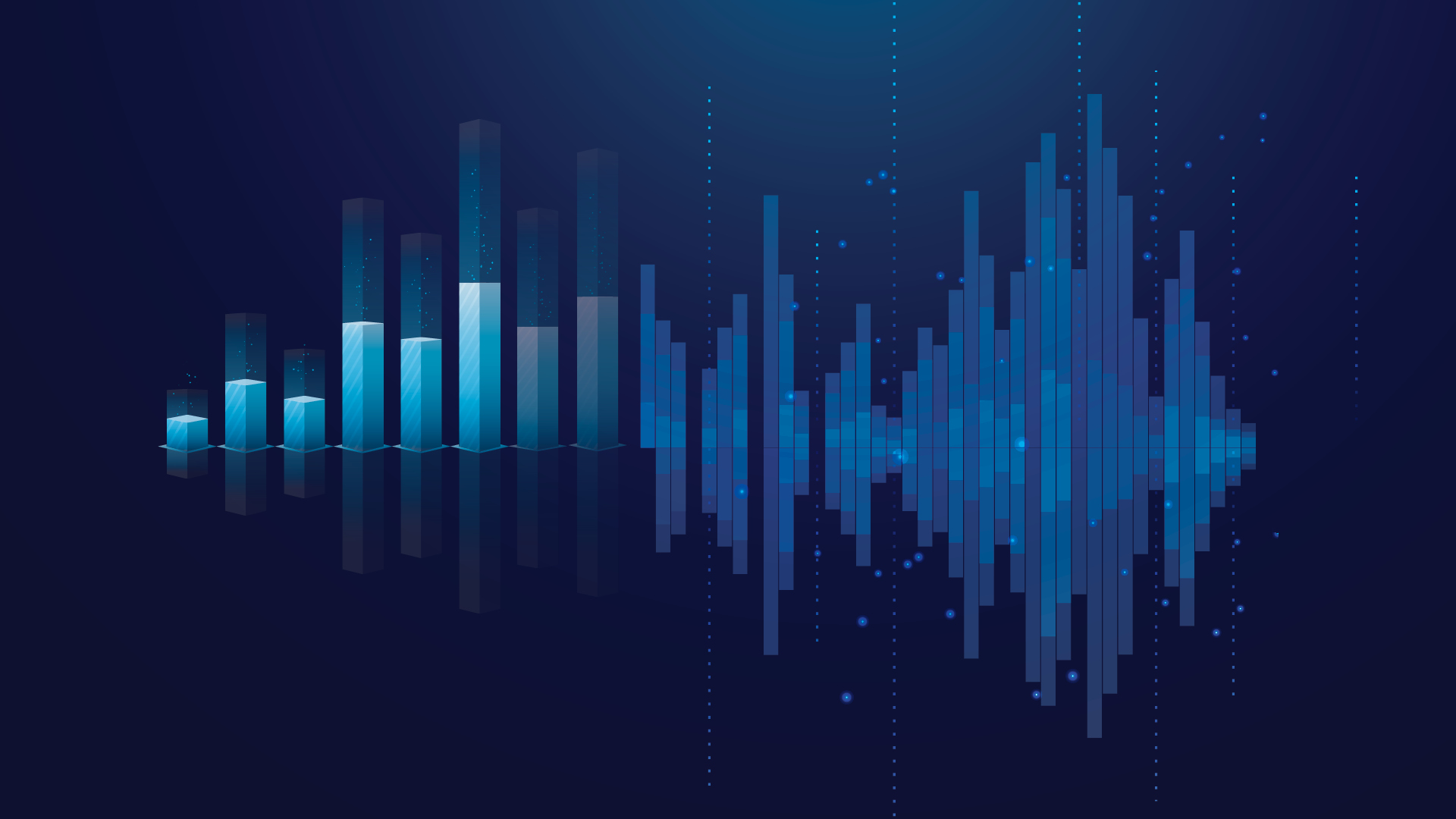
Data sonification is the representation of data through sound, aimed at communicating the information it contains. Just as data visualization turns numbers into images to make them easier to understand, sonification turns them into melodies. Instead of using vision, it relies on hearing to reveal patterns within datasets, drawing on the human ear’s ability to recognize them. In the same way that data visualization uses colors, shapes, and sizes, sonification makes use of volume, pitch, rhythm, and duration.
According to the Sonification Archive, a curated collection by researchers Sara Lenzi and Paolo Ciuccarelli at the Center for Design, Northeastern University, which looks at how sound can broaden the audience for data, the first experiments with sonification took place in 1966 in scientific fields mainly concerned with the environment and space. “It’s really young and not learned,” says Christian Basl, a data journalist at Germany’s WDR and creator of DataSonifyer, a tool for generating data sonifications. Together with Berit Kruse, Basl runs the SoniFriday sonification project, and the pair also presented the workshop “How to make data sound” at this year’s iMEdD International Journalism Forum.
[When] you come to a point [where] words don’t help to tell something, then you can use sound or sonifications [so] that your listeners feel what you can’t tell
Christian Basl, data journalist at Germany’s WDR
Investigating data available on social media platforms
Although social media is an important “channel” for publishing journalistic investigations, it is also a rich source of information for all kinds of journalistic research. At the Dataharvest 2025 conference, we learned useful ways in which journalists can gather data from platforms for their investigations.
Which sound is right for telling a story?
To illustrate the difference between a semiautomatic firearm and the rifle used in the 2017 Las Vegas mass shooting, Larry Buchanan of the New York Times didn’t list rounds per minute. Instead, he mimicked the sounds himself: the semiautomatic goes “bang-bang-bang,” while the Las Vegas weapon went “brrt-brrt-brrt.” (Ironically, unlike the story itself, we use dashes and repeated letters here as visual cues to help you imagine the sound.)
Buchanan and his colleagues, Jon Huang and Adam Pearce, used sound to convey this distinction to readers in their article “Nine Rounds a Second,” published the day after the mass shooting. “Because we wanted you to understand the thing we’re trying to get you to understand as fast as possible […]” Buchanan explained.
Journalism, and data journalism in particular, is an ideal field for applying sonification, as it constantly seeks engaging ways to present complex data to audiences in an understandable way. This is exactly the approach taken by the journalists at SoniFriday. “[When] you come to a point [where] words don’t help to tell something, then you can use sound or sonifications [so] that your listeners feel what you can’t tell,” says Christian Basl.
The close connection between sound and emotion creates one of the biggest dilemmas for journalists: which sound is right for telling a story? “What I think is particularly interesting about sonification is that these things that have not been aesthetically designed can absolutely be used for storytelling, and they carry a ton of emotion. Hearing a Geiger counter is a scary thing, you know, [or] hearing the beep, beep, beep of a heart rate,” says Duncan Geere, an information designer, data journalist, and member of the Loud Numbers project with Mirriam Quick.
“I think in terms of when it might not be a good idea to start there, it could always be something that’s just too emotional if you listen to it. Like shootings, for example, is something that people can actually listen to, but that would just be very disturbing,” Kruse notes. For Buchanan’s team, choosing electronic sounds instead of the actual sound of a gun made their piece one of the most successful examples of using data sonification responsibly.
As journalism moves further from the page, the field’s engagement with sound-based formats, like radio, podcasts, and video, creates fertile ground for experimenting with alternative ways to represent data beyond visualizations. On their podcast, Loud Numbers tries to explain data purely through sound. “Every episode starts with a story, and then we move on to the dataset,” Geere explains.
DOs & DONT’s for data sonification by Loud Numbers
DOs
- Think about the story you want to tell. You’re creating a narrative in sound, so make sure the relevant parts of your dataset, the ones you want people to focus on, can clearly be heard. This might mean zooming in on part of a dataset, or transforming it, for example by binning, smoothing, or aggregating it.
- Choose your mappings – the audio parameters that scale with the data values – carefully.
- Lean into the emotional dimensions of sound, but be aware that you have an ethical responsibility that comes with this. You need to play kindly with your listener’s emotions. Sounds can be deeply evocative – think of how a funeral bell makes you feel. And now think of an airhorn. Some mappings are more intuitive than others, and some may be more or less appropriate, depending on your story and audience. If your story deals with a serious subject like a shooting or a famine, maybe don’t use an airhorn.
- Iterate and test things out. Use trial and error to home in on the right solution for your story and test the results on your audience. You’ll know you’ve got it right when your listeners can hear the data story unfold and the result packs an emotional punch. It can take time, but the effort is worth it.
DON’Ts
- Feel restricted to mapping data to pitch. It can be a good solution when your data is precise, since most people can hear small pitch differences. But it can also be ambiguous – do larger data values map to higher pitches, or lower ones? Mappings like volume or the level of an effect like distortion or reverb, while less precise, can be more impactful. And of course, you can double or triple-map, for example by mapping to pitch and volume at the same time.
- Cram in too many data-driven sound layers: one is fine, and two or three is plenty. Unless you don’t mind whether people can understand the data story, and want to create a multifaceted piece of data-driven generative art. In which case, go wild.
- Expect your sonification software to do the hard work for you. There are loads of brilliant tools out there for sonification work, but they are just that: tools. The best results come when you take creative control and push beyond the immediate thrill (and novelty factor) of “I’ve made some bleeps and bloops from data”.
Read more at the Data Sonification Manifesto
How non-coding journalists can build web scrapers with AI (examples and prompts included)

A guide on non-coding journalists using AI to build web scrapers and access complex public data for their investigations.
Familiarity and speed vs. data sonification
It’s still not entirely clear how people perceive and interpret data through sound. For Loud Numbers, transparency about the decisions they make when processing data is what helps the audience become familiar with the method. “We want people to understand all of those things, how we’ve communicated data values through audio parameters like pitch or rhythm or loudness or the strength and effect like reverb or delay,” says Mirriam Quick.
Creating sonifications is still not standardized enough for most data journalists to use easily. Buchanan notes that the lack of tools means sonification isn’t usually the first method that comes to mind when preparing a data representation. Unlike visualizations, where tools have become accessible and simple to use, data sonification still requires complex software unfamiliar to most journalists.
Familiarity with the tool isn’t the only challenge. “We have to be fast […] because things only stay in the news cycle for so long,” explains the New York Times graphics editor. The more interaction a story requires, the more time is spent thinking about its design, which can slow things down in the fast-moving world of news websites.
Data sonification resources
Visit Desibels community on GitHub for tools and resources on data sonification.
Moving beyond description?
The Loud Numbers team recognizes that, especially in journalistic projects, explaining and narrating sonifications is essential. “People don’t learn sonification in school the way they learn visualization and other kinds of charts. So I do think that you need to give some examples. You need to say this is how it works,” Geere says. Quick underscores the importance of guiding listeners through the sounds: “[We use] anything to stop people feeling lost and bewildered when they’re in the middle of this wash of sound, because sonification’s quite unfamiliar to people.”
On the other hand, Buchanan believes that in journalism, the combination of speed and clarity is what makes a data presentation successful. “If you can play on the way the brain already works and the patterns that the brain is trying to find in order to tell me what is a very complicated story in a very simple picture, then that’s a very valiant thing to do. […] [G]ood data presentations are fast, powerful, and kind of apparent on their own. They’re not complicated, and maybe at some point they are beautiful, but I would put that value way farther down the list than clear,” he explains. He adds, “It has to be better than the words alternative, you know. So if you were to describe the thing that we are looking at in words, is the data presentation version better than that?”
All of them, when discussing the benefits of data sonification, mentioned accessibility: instead of someone describing a chart, you can listen to what the data shows.
Johny Cassidy, a BBC journalist who focuses on accessibility, notes that a sonification can only be accessible if it is simple and easy to follow. “It’s important to understand that if you can’t see something, then having many layers of sounds competing for your attention—different rhythms and different pitches—can be confusing,” Cassidy explains.
For Cassidy, who uses a screen reader, sonification cannot exist without explanatory text. Often, the challenge is that many journalists creating sonifications are not themselves users of screen readers. “[T]hey’re still working from a visual perspective […]. They may have got it in their head what the trend is, what it is they’re trying to illustrate. So it’s hard to create something that is going to be a good, useful accessibility experience because you already know what it is that you’re trying to create, you know what the data points are,” he adds.
He prefers using alternative text (alt text), the textual description that accompanies and explains an image on a website, for people who cannot access visual content, although he doesn’t dismiss data sonification as a method for improving accessibility.
For SoniFriday, that’s also where the appeal of data sonification lies. “In terms of illustrative or informative, it can just be both depending on the sound design and what you want to lean in towards a bit more,” Kruse says. “It can be a lot more like a musical piece if you want it to be artsy, and then it can also be much more informative […]. So I think that’s actually really fun about it. It can be both,” she explains.