
A guide of tools and sources for crafting impactful stories through data visualization
As knowledge and proof of truth are quantified in big data, a question arises more often than not in the journalistic field. During iMEdD’s International Journalism Forum 2023, professionals from the field of visualization came together to talk about new ways of compelling storytelling. During his talk “Empowering change with creative 3D visuals and maps”, Julian Hoffman, data visualization consultant and designer, materialized the question hanging in the air: “Is there a way for data to touch the reader?”.
The faces behind the numbers: César Dezfuli’s “Passengers”

César Dezfuli’s images narrate the stories of the central figures in the refugee/migration crisis in Europe. Going beyond mere statistics and numbers, these photographs document the integration of migrants from West Africa into various countries on the Old Continent.
Why do we need good visualizations?
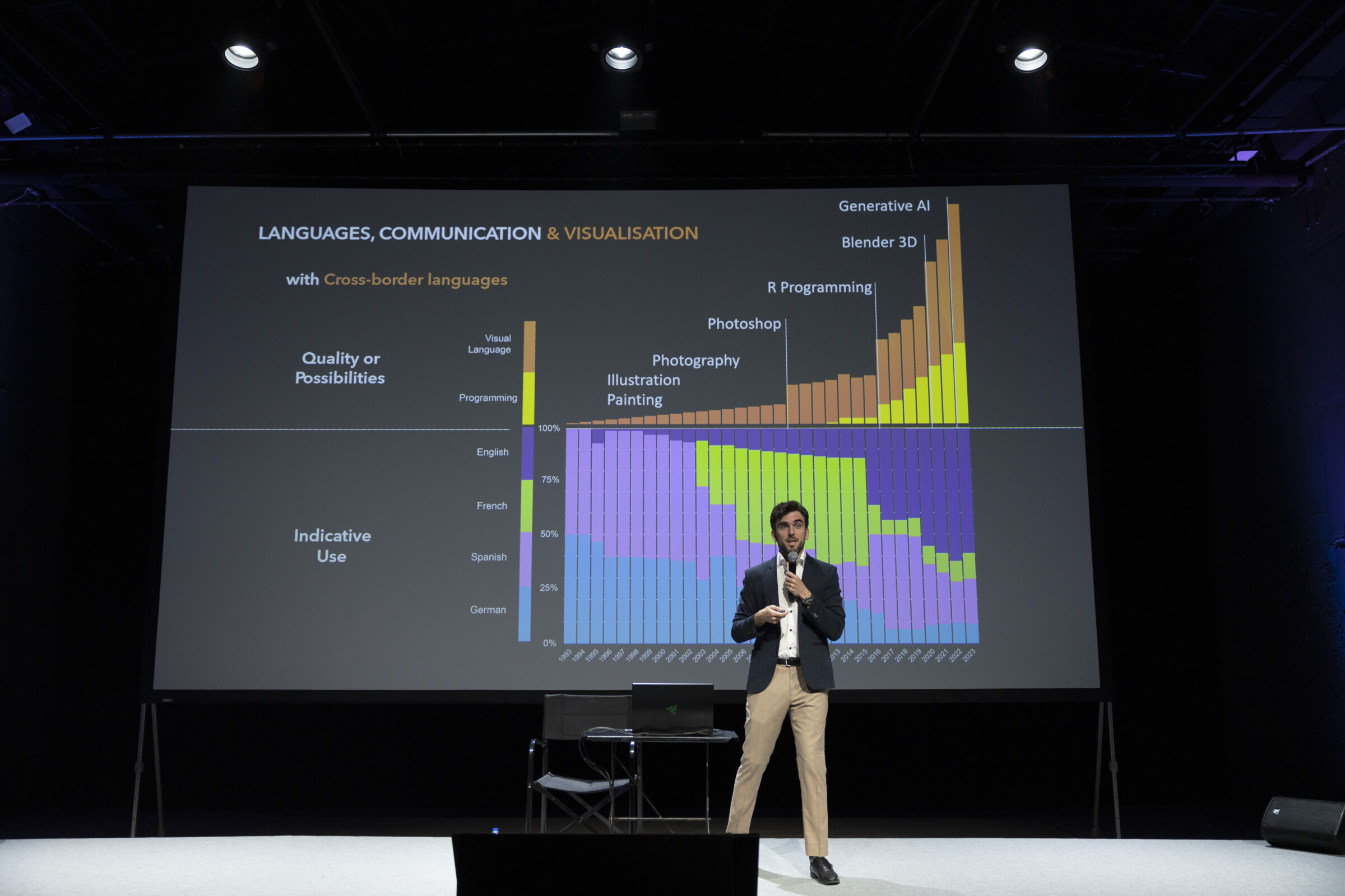
Numbers are universally understood, yet simply presenting a few of them is often insufficient for achieving a comprehensive understanding or for illustrating an argument convincingly. According to Hoffman, visuals convey the entire story. Although he speaks four languages, the imagery makes his narration universally accessible. “For me, visual languages mean I don’t have to translate everything I think”, he admitted to iMEdD via his home computer in London after the completion of the Forum.
“Data visualization is a technology—or set of technologies—and, like artifacts such as the clock, the compass, the abacus, or the map, it transforms the way we see and relate to reality”, writes Professor Alberto Cairo in his book “Data Visualization in Society”. Data visualization is essential for both the reader and the journalist. Effective visualizations will allow both of them to understand their own data and to communicate their insights to others. Examining an excessive amount of numbers when analyzing data can be tiring for anyone. However, visuals can aid in offering perspective, identifying weaknesses in your data analysis, and pinpointing the outliers in the data.
But visualization is not only about expanding reach but also enhancing the understanding of the story. A 2017 study by Kennedy and Hill discusses the emotional impact of data visualizations on people and the sociological significance of making complex databases accessible to audiences of diverse expertise and educational levels.
That was when data visualization caught my attention, because of the possibilities. Statistics could be explained in a page or summarized only in a picture.
Julian Hoffman, data visualization consultant and designer
Tipping into the basics of Artificial Intelligence: Lessons from Jonathan Soma

Professor Jonathan Soma provides essential insights into Artificial Intelligence, suitable for both newcomers and seasoned professionals, presenting an optimal entry point for anyone in the tech field.
The tools on your belt
“I always liked graphics, charts, and maps, but then I discovered the range of data visualization possibilities that combined both my scientific and artistic side. When it connected, I applied programming languages”, says Hoffmann. “That was when data visualization caught my attention, because of the possibilities. Statistics could be explained in a page or summarized only in a picture”. Various tools exist that do not demand coding expertise. However, integrating programming into the data visualization process can elevate the outcomes. Here are some tools, categorized by difficulty levels, which can be helpful when working on data visualizations.
- Journalists commonly favor Datawrapper and Flourish. Their user-friendly interface, pre-set color palettes, and step-by-step creation processes allow greater exploration of these websites’ possibilities. Having a preliminary visualization concept in mind is advisable because structuring the data must align with the website options. These tools can be integrated into Excel and Google Sheets and support file formats like CSV or XLSX, adding to their convenience and accessibility.
- Plotting libraries such as Matplotlib and Plotly are built on Python and its numerical extension, NumPy. While Plotly is also known for its user-friendly interface and 3D graph support, both are used for data visualization. They offer interactive features and are compatible with common programming languages for visualization, including Python and R. Another library suitable for this purpose is Seaborn, which is constructed on Matplotlib and can deliver more aesthetically pleasing visualizations.
- After familiarizing oneself with simpler tools, coding becomes a fundamental aspect of the visualization process. These tools become more challenging and require a deeper understanding of Python. However, the payoff is the ability to create any kind of visualization, providing the utmost creative freedom. D3.js is an open-source JavaScript library that used to be one of the most used tools in the data journalism community, adopted by media outlets like Reuters. However, its usage has waned in favor of its relative, Observable. Both were created by ex-New York Times graphic designer Mike Bostock. Observable JS is known for its responsiveness, albeit with a subscription-based model. Notably, they can both be used within Jupyter Notebooks.]
- Sometimes, it is beneficial to post-edit visualizations to enhance them, make them more aesthetically pleasing, or align them with your narrative. However, these tools can become a bit of a challenge for users, since they demand a considerable amount of practice. “If you want to learn a new tool, experiment on a personal project because then it feels more like a game or a puzzle than work,” Hoffmann advises. His preferred tool for 3D visualizations is Blender, a free, open-source software that allows artists to perform the entirety of the 3D process, from modeling to motion tracking. Adobe Illustrator is another software artists utilize since it serves data visualization purposes. In the case of Illustrator, it aids in cleaning your stat and editing elements within your existing graph to simplify or make it more interesting.
- The case of maps is an interesting one and needs a bit more research and adaptation. Though Flourish and Datawrapper offer practical options for crafting interactive maps, more programs can help you fill your toolbox. The open-source software QGIS has great analytical capabilities while processing coordinates, OpenStreetMap data, and plugins that make it more functional. Mapbox provides its API for better integration of the maps on web applications and sites. If there is a greater interest in map-making design, The Economist’s maps style guide can be helpful, while you can also draw inspiration from the Le Monde map page.

Beautiful information are memorable and impactful.
Julian Hoffman, data visualization consultant and designer
Storytelling on TikTok: Opportunities for journalists

Three journalists explain at the iMEdD International Journalism Forum 2023 how they use TikTok to create impactful content that both informs and entertains the public.
Aesthetics, utilization, and exploration
One of the most challenging aspects of creating a visualization is determining the appropriate type of data. As the Statistical Consulting Center of the University of Melbourne states, the famous pie charts may not be ideal for presenting quantities. This is particularly true when the percentage to be conveyed represents a small portion of the whole. However, there are plenty of ways to approach the visualization of quantities.
- Guides like Data Visualization Catalogue, created by Severino Ribecca, or the Financial Times visual data vocabulary can help you understand the idea behind each visualization type and whether it is well suited for your story and/or data.
- For better styling guides, The Economist’s visual style guide and the Data Viz Design Guide by Jonathan Soma are also worth consulting.
- The monthly podcast DataViz Today hosted by Alli Torban can provide you with further tips and tricks and present new tools and experts from the field.
Usefulness and creativity blend in a transformative way through data visualization. The study “Seeing is believing: The importance of visualization in real-world machine learning applications” mentions: “To explain the success of visualization as a data exploration tool, we should not brush aside the aesthetic aspects involved. Put simply, pretty pictures are useful because they appeal to us at an extremely basic, non-discursive level. Usefulness and beauty can certainly be indistinguishable concepts.” In every act of creativity, aesthetic appeal is much needed. The realization for Hoffmann came through one of his first encounters with the possibilities of visualization: the 2010 TEDTalk of David McCandless, “The Beauty of Data Visualization”. “If you collide the language of the eye with the language of the mind, you simultaneously start speaking two languages”, he says in his talk.
Like all language learning, engaging with the language one wants to learn can only improve one’s knowledge. For data visualization, this means looking at others’ work and imagining new visuals. Inspiration can come from unexpected places, like different movies, magazines, or other artists. Hoffman points out that his visualizations became better when he started “writing down all ideas whenever they came, because, even the best ideas, you forget them”. The Chart Doctor of the Financial Times, their data journalism page, and visualizations from The Economist, The Pudding, and The Guardian can be sources for infinite scrolling and inspiration.
Nevertheless, the presentation highlights the importance of a high-quality data analysis. If the data source is not good or the analysis is incorrect, it does not matter how nice the visualization will look – the result will still be wrong. Only if all three elements are present –source, analysis, and visuals– you have the perfect data story.
“We are in a golden age for visual data communication”, Hoffmann says at the end. He explains that tools are available for everyone to use, and human knowledge is accessible for everyone to learn. The possibilities are endless. Nowadays, when everything is made of numbers and figures, great visualizations can have a significant impact, a fact that journalists often undervalue. Hoffmann stands firmly by his belief: “A good article with no visuals is an article with a terrible weakness”.
Watch the full panel discussion here:

