
The iMEdD Lab’s COVID 19 application that follows the evolution of the pandemic in Greece and the world, was first published on March 16, 2020. Ever since it’s updated constantly with any available data about cases and deaths. On December 2nd, we rolled out the redesigned application introducing further analysis and integration options to its users.
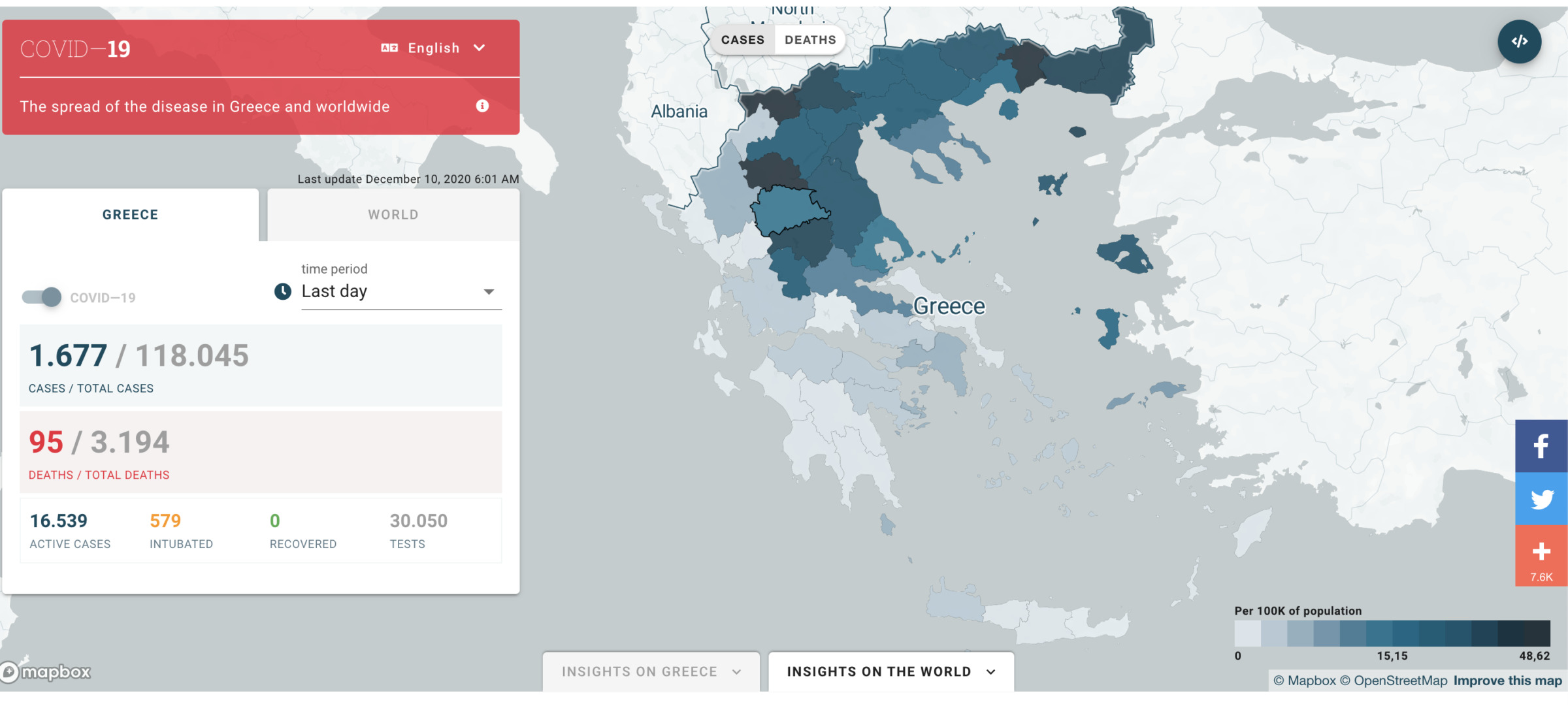
The application has four major areas: the side menu, the map, and the insights on Greece and the world.
Α. On the side menu the user can choose which view of the map is interested in, Greece or the world. The “time period” filter specifies the time period to be visualized on the map as well as the values displayed in the menu (cases, deaths, active cases, etc.). The values it contains are:
- Last day the map shows cases and deaths according to the latest official announcement.
- Last 14 days
- Last three months
- Historical data (from the start of the pandemic)
At the top of the map, we can choose whether we want to visualize cases or deaths. The lower right explains which value corresponds to which color. Mouse over displays information for each regional unit or country.
Embedding options
An important change of the updated application is the ability to integrate in your pages each view of the map (and graphs) separately.
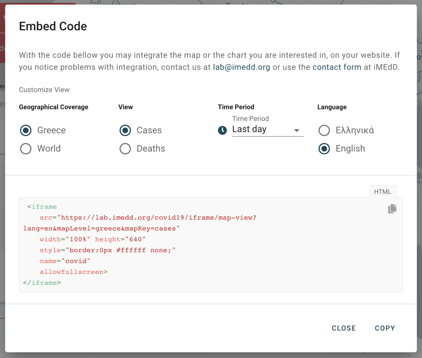
To embed the map on your page, press the “</>” button. The above window will then appear, in which you define what you want the map to visualize. For example, if you want to embed in your page a map showing the cases reported on the last day, you must select the corresponding filters.
The gray box below will automatically generate the iframe you will use to embed the map. You can adjust the “height” to fit the dimensions of your page. The map will look something like this:
In the fields “insights on Greece” and “insights on the world”, you will see the charts that analyze the evolution of the pandemic. You can embed each graph separately on your page in the same way as you do the map. The difference in the graphs is that the filters of each graph are also embedded.
To understand how we made the application and to view or download the data for COVID 19 in Greece, visit the respective pages.

