A step–by–step explanation of how to read the ECDC map, and which are the reasons why even if the Greek islands visualized as green are actually “green”, we don’t really know it for sure.
From October 15 onwards, the European Centre for Disease Prevention and Control (ECDC) publishes a series of maps every week, regarding the progression of the pandemic across Europe. These maps are made public following the Council Recommendation of October 13, 2020 approved by the EU member countries for a coordinated approach to the restriction of free movement in response to the pandemic. The ECDC maps are published every Thursday, to reflect the epidemiological situation of the past two weeks and are based on the official data provided to the European Surveillance System (TESSy) database by each Member Country by midnight of every Tuesday.
Greece Rapid Testing Map
A total of 2.433 positive samples were detected, with Xanthi (November 19) having the highest positivity rate.
Schools in suspension of operations, after the reopening
The educational units that are found under partial or complete suspension of operations throughout Greece, due to cases of coronavirus, one week after reopening primary schools, kindergartens and special schools of all levels.
COVID-19 Interactive Map: Vaccine tracker across Greece
Real-time updates on vaccination per Greece’s Regional Unit
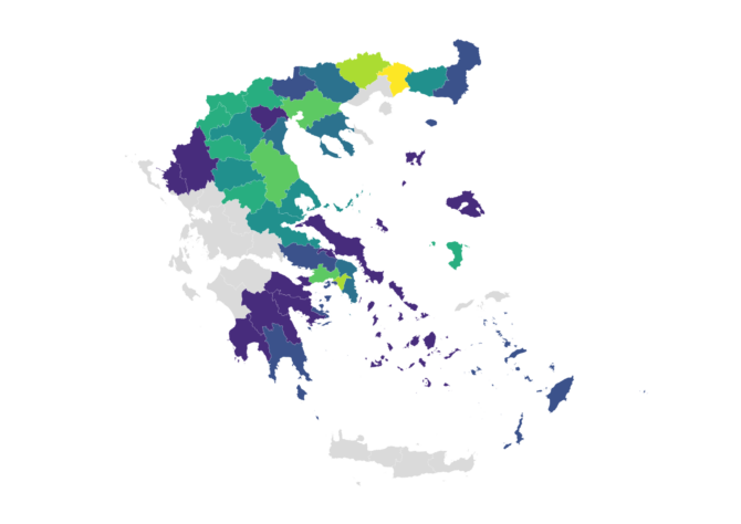
Of these maps, the most important and widely reproduced is the map that demonstrates the combined indicator of the rate between cases, tests and the so-called “positivity” in each local population (“Combined indicator: 14-day notification rate, testing rate and test positivity”). In this map, we see the continent broken down by region within each country, with each of these regions taking a color based on data analysis, as the ECDC states in the explanatory notes preceding the map on its website:
- “green” are the areas where the cases of the past two weeks are less than 25 per 100,000 local population and the test positivity rate, that is the ratio of positive tests to the total number of tests in the past week, is below 4%
- “orange” are the areas where the cases of the past two weeks are 25-49 per 100,000 local population, but the test positivity rate is 4% or higher –or the latter is lower than 4% but the cases per 100,000 local population have been 25-150 in the past two weeks
- “red” are the areas where, in the past two weeks, either 50 or more cases per 100,000 local population have been recorded and, at the same time, the test positivity rate is equal to or higher than 4%, or more than 150 cases per 100,000 local population have been recorded
From December 24, 2020, when the ECDC map on the reference period December 7-20, 2020 was published (in the visualizations of ECDC, the weeks are numbered according to the ISO–8601 standard), Greece consistently appears to be one of the few countries with “green” areas. In fact, in the latest map release, published last Thursday, January 28, on the reference period January 11-24, 2021, our country appears to be the only EU country with “green” areas (the Ionian Islands, Crete and the South Aegean islands) on the European map of the pandemic. It is not the first time that this message is being widely circulated –after all, the Prime Minister himself made a relevant reference at the Parliament on January 15, based on the then release of the said map.
The lack of data as a problem of documentation
It is precisely here, in circulating the message that Greece has “green” areas that a pre–existing problem is growing: the fact that, actually, even if our country indeed has “green” areas, this is not something we can know for sure due to lack of data. According to the official data of the ECDC, which are visualized on the map and which the ECDC offers openly and freely for retrieval by anyone interested, no data are available on the number of tests carried out per region in Greece. The iMEdD Lab got in touch with the ECDC to confirm that the ECDC publishes all the data sent by the Member Countries and that, unfortunately, Greece has never, to date, sent any data regarding the number of tests carried out per geographical area. In regard to our country, the only data about the tests that are available to the ECDC, are the total number of tests carried out in the Country per week. This comes in addition to the lack of relevant data in the daily epidemiological surveillance report of the National Public Health Organization (NPHO), which now includes data on the recorded confirmed cases per regional unit, but, to date, has never included relevant data for the tests carried out.
Greece has never, to date, provided the ECDC with any data regarding the number of tests carried out per geographical area. Consequently, it is impossible to calculate the test positivity by region.
Consequently, it is impossible to calculate the test positivity by region (or by any other geographical level). In the same communication of the iMEdD Lab with the ECDC, it was also confirmed that, in the cases of countries that do not send numbers of tests carried out per region, the ECDC only uses the indicator of test positivity at the Country level, applied in every region, for the production requirements of the said map.
Effectively, this means the following: in the third week of the year (January 18-24, 2021), a total of 176,183 tests were carried out and 3,373 total cases of COVID-19 were confirmed in Greece, according to the data available to the ECDC. Therefore, the test positivity rate is estimated at 1.91%, at Country level. Although we do not know how this percentage is shaped at a regional level, it is this same percentage (1.91%) that is taken into account in each region, along with the number of recorded cases per 100,000 local population for the colors with which each region is presented on the map to occur. Consequently, there is no way of knowing if the green areas are actually “green” or if the color attributed to them is the result of taking into account a possibly underestimated local “positivity”.
One could hypothesize that, if the “positivity” is estimated at 1.91% nationwide, then this could be an average value of a range of local “positivity” rates that remain below 4%: that is, one could make the assumption that the ratio of positives to total tests in each region may be within the “green” limits of ECDC in terms of “positivity” at the local level. Again, no data is available for anyone making the assumption to cross-check.
However, in the case of Greece, no one can talk about a true reflection of the indicator that combines cases and “positivity” at the local level. In essence, the color differentiation per region is based solely on the ratio of cases recorded in the local population –and if one looks at the corresponding map which shows solely this (“14-day case notification rate per 100,000 inhabitants”), they won’t find any “green” areas in Europe at all.
The “positivity”, the tests and the unanswered question
At the same time, in more specific terms, speaking of the so-called test positivity one needs to weigh in the fact that this is expected to be the result of the following simple division: confirmed cases per number of individuals tested at the same time period. In fact, the ECDC, in its instructions to the Member Countries regarding the data to be sent, states that the total number of tests is considered to be the total number of individuals tested during each epidemiological week and that for individuals with multiple tests within the same week only the first test should be taken into account.
A total of 19 countries provided data on tests performed at national level only. Greece, however, is the only country among the 19, which has two colors to demonstrate within its territory.
In the case of Greece, the data regarding the weekly tests, which are included in the open, available data of the ECDC, seem to be almost in line with the corresponding data included in the daily reports of the NPHO which refer to total tested “samples”. Specifically, these reports show that within the third week of the year (January 18-24, 2021) a total of 174,962 “samples” were tested, including RT-PCR and Rapid Ag tests. During the same period, according to ECDC data, a total of 176,183 “tests” were performed in our country. In the event that these “samples” may contain more than one sample taken by a single individual in the same week, one should assume that the number of people tested for more than one “samples” is statistically insignificant, for the estimated “positivity” (1.91%), at Country level, to be underestimated.
At least, this seems to have been the case until the beginning of September 2020: up until then, the NPHO included in its daily reports, in addition to the total number of cases in the country, the absolute number of total positive “samples” –and the ratio of those to the total number of “samples” tested was the estimated test positivity. Until then, the two sets (cases and positive “samples”) were different, but this difference was not statistically significant: for example, on September 5, 2020, the NPHO announced that, by then, a total of 11,386 confirmed cases had been recorded in the country and at the same time, a total of 11,401 “samples” had tested positive for coronavirus, out of a total of 1,015,064 tested “clinical samples”. We do not know how the relationship between the two numbers has evolved since, given that from September 7, 2020 onwards, no total number of positive “samples” can be found to be included in the daily reports of the NPHO.
Finally, it is worth noting that Greece is not the only country to not send data on the number of tests per region within its territory: in particular, according to published data from the ECDC, in the third week of the year (January 18-24, 2021), only 11 Member Countries submitted data regarding the tests at a regional level (as well), while a total of 19 countries provided data on tests performed at national level only. Greece, however, is the only country among the 19, which has two colors to demonstrate within its territory. This could lead to the following research hypothesis: the tests may be conducted disproportionately across the country and, therefore, the proportion of recorded cases in the respective local population may be affected.
Unfortunately, the data that would be necessary in order to refute or confirm this working hypothesis are not available, thus the latter remains an unanswered question –another unanswered question is whether the green areas on the ECDC map are actually “green”.
Translation: Evita Lykou